Showing posts with label Modern. Show all posts

Sunday, June 16, 2013

Building on our vision of modern computing

Hello Julie and congrats for the great job you guys are doing on both Windows and Windows Phone.

I am using both Windows 8/RT across my PCs/Tablet and Windows Phone 8.

I love and strongly believe and supporting to Microsoft's new vision that introduced with the new Windows. I am following the Windows Blue development very closely and I really like what I see so far (well from the leaks) Windows 8 evolving and changes based on customer feedback and while I see you guys responding to almost all major criticism on Windows 8, I am surprised and kind of disappointed that one major subject has not been discussed, or leaked yet. It is my personal No1  complain from the Windows 8 and Windows Phone 8 and my No1 request for Blue in both Windows and Windows Phone, its causing major problems to me and thousands if not million others and its nothing else than the absent of a real Notification Center.

Currently the Notifications on Tiles method you are using is causing the following issues:

1. The only way to get Notifications is to pin a Tile to the Start Screen, so we have to pin tiles for Apps we do not even want to have in our Start Screens just to get Notifications.

2. Even then, the Notifications are spread across the Start Screen (which is getting bigger and bigger in daily bases) and we have to manually scan every single tile to spot a numeric notification on Tile.

3. Notifications are hardly synchronized across my Windows devices. I read a Skype message on my phone and its still shows on my Tablet for example until I read it again from there. That happen with many apps.

4. Lock Screen Notifications are limited to a specific number. I never had more than 7 notifications pending in my lock screen at the same time, but I always have more than 7 Apps issuing Notifications in different times and due to the App limit we cannot have proper Lock Screen Notifications, I am always missing something because of the App limit.

5. App specific Controls like Music controls are appearing randomly on the screen

So basically we have a great App oriented OS with most Apps issuing and generating Notifications and we do not have a Notification Center to handle them properly.

Like all major competing OS already offer, we also need an advance Notification Center to host and organize ALL App Notifications under one roof and be able to read, or dismiss Notifications from there easily. From the same place we can also access App Specific Controls like Music Volume etc. All App can then push the same notifications (just numeric and not in detail) on the Lock Screen, there is no need for Notifications Limit on the Lock Screen please take off this limitation.

I really really really hope you guys are working on it for BOTH Windows and Windows Phone Blue (it just didn't leaked yet)

I really hope that finally a real Notification Center will be a major part of the next update.

Keep up all the good work, I hope such a feedback will help the team even farther.

Thanks


View the original article here

Review: Easily edit images and create collages using Fotor in Windows 8's Modern interface

AppId is over the quota
Fotor Fotor is no Photoshop, but it's simple, fun, and works well for basic image editing.

Download Now

If Picasa has taught us anything, it's that not every image editor has to be Photoshop. Sometimes you just want a quick, fun way to enhance your photos, add some neat effects, and maybe create a collage or two. If that sounds like fun and you happen to be rocking a Windows 8 device, you should check out Fotor, a free photo editor that uses the Modern interface. It's fast, visual, and has virtually no learning curve.

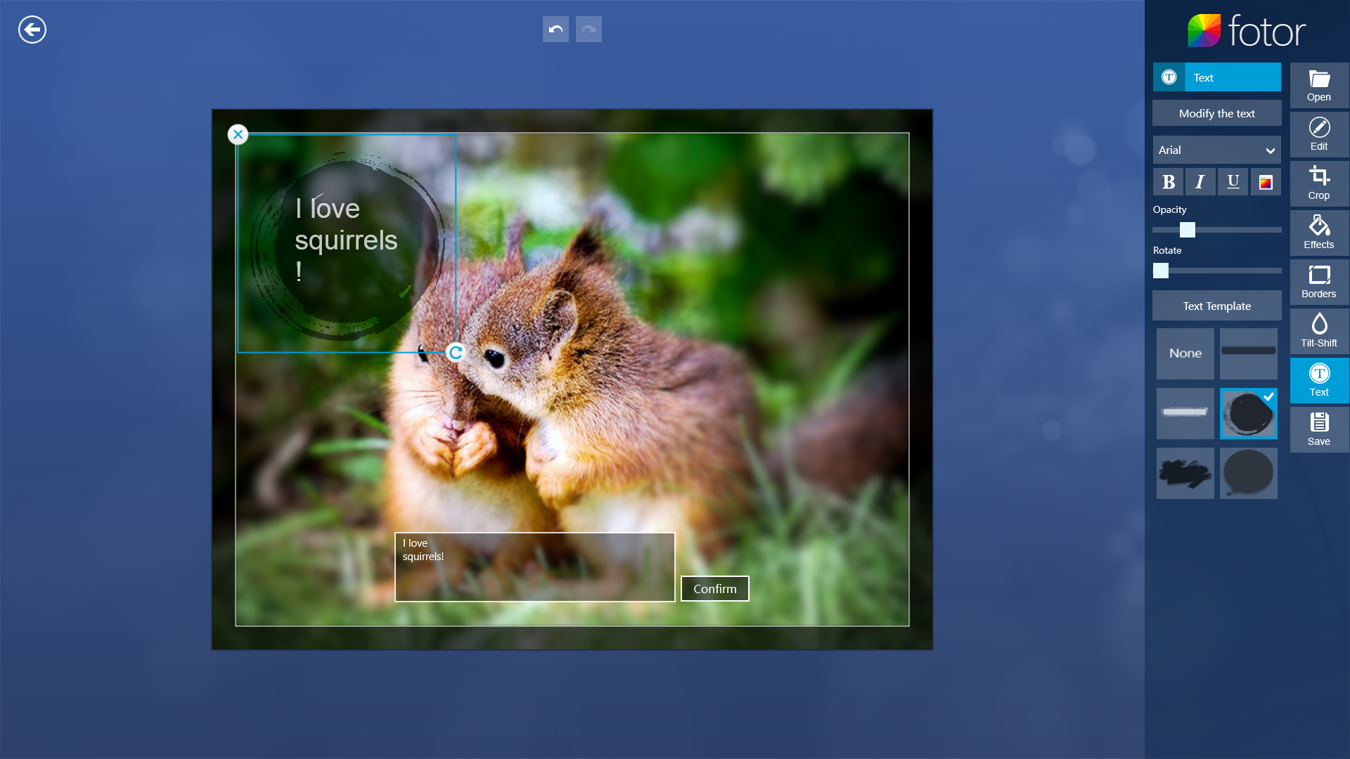
Fotor makes it easy to add text overlays to images, but you can control the font size independently.

When you launch Fotor, it lets you open an existing photo to edit, or start working on a collage. It also comes with six sample photos arranged in an attractive grid, to get you started. The simplest way to get a feel for what Fotor is like is to click a sample photo. Do that, and you'll find yourself in the editing interface.

In editing mode, the image dominates most of the screen, and an editing toolbar lines the right side of the screen—opposite where you'd normally expect it, but in keeping with the Modern interface convention. The toolbar is subdivided into eight sections, six of which contain editing tools: Basic editing (color corrections), cropping, effects, borders, focus effects, and text tools. The other two sections let you open new files for editing, and save your work.

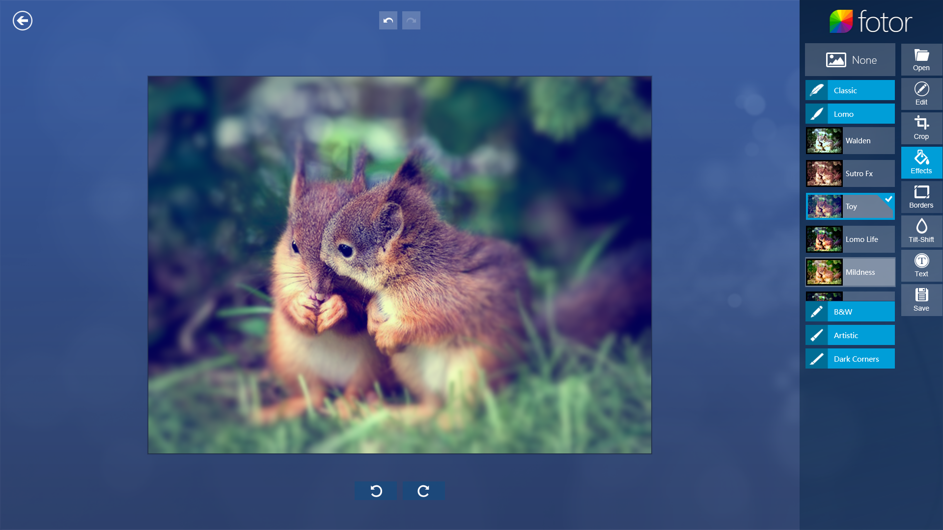
Fotor offers numerous effects, including crowd-pleasing Lomo looks

The color correction interface uses sliders, with live image updates: Just move the slider and see the change instantly. Cropping is similarly intuitive, with 11 preset aspect ratios, and a free-crop mode (to set your own aspect ratio). Just drag a frame across the image to set out your crop area, and click Confirm when you're happy with the composition.

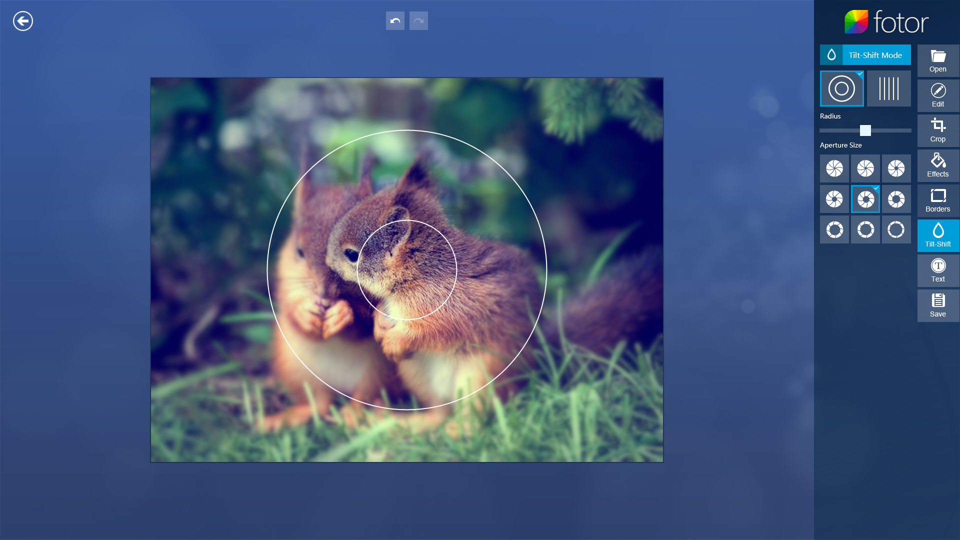
Fotor's selective focus tool is the most nuanced one in the app, allowing for fine adjustments.

Image effects are divided into five categories, ranging from Classic to "Dark Corners" (i.e., vignette effects). While each category contains many different effects, individual effects cannot be adjusted in any way. Many of the image modifications are heavy-handed, and Fotor offers no way to tone down the amount of influence a given effect has. Also, you can't layer effects one on top of the other. You need to pick one effect for your image and stick with it. The Borders category is similar: There's a rich selection of borders, but you can't tweak anything, like the size of the margin or the color of a given border.

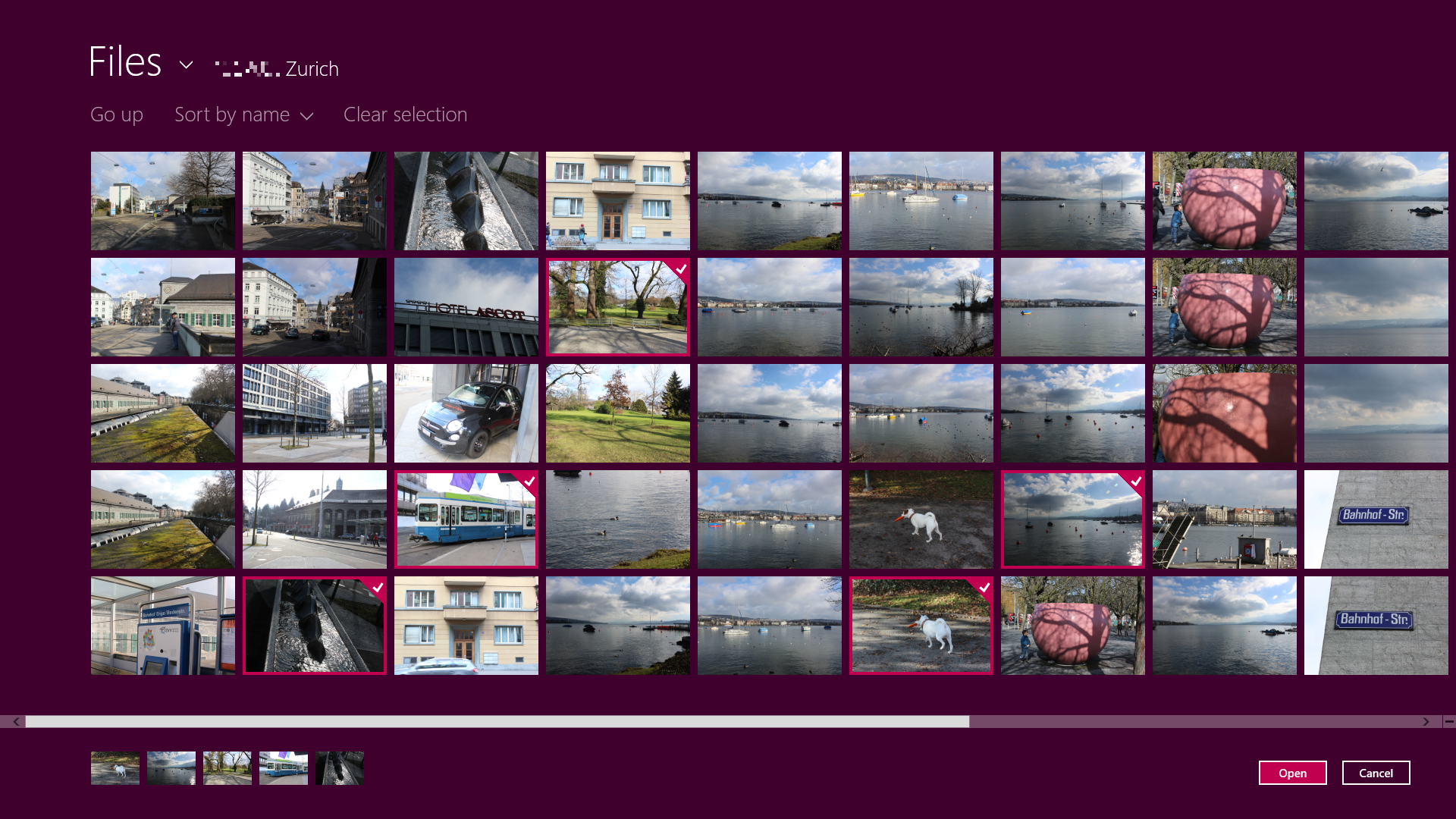
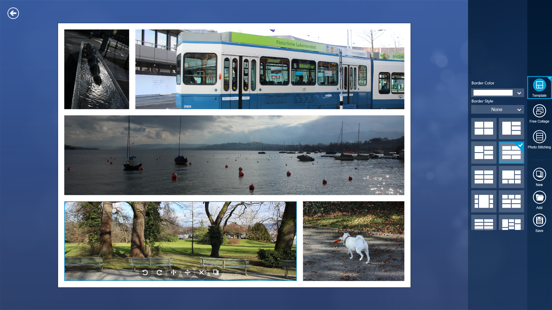
Fotor's collage mode makes it easy to pick a number of images for your collage.

One category that does offer fine-grained adjustments is the Tilt-Shift Mode, whereby you can apply selective focus effects to your image. Tilt-shift (a "miniature look") isn't the only option: You can also apply a center focus effect, where the subject appears sharp and surrounding detail is blurred out. Both center focus and tilt-shift effects offer many adjustments: You can change the tilt shift's angle, and change either mode's blur radius and virtual aperture size. Of all the tools Fotor offers, selective focus is the most nuanced.

Finally, you can also overlay your image with some text. The text tool offers a limited number of fonts (you can't pick from any font installed on your computer), and lets you pick one of several overlay templates, such as speech or thought bubbles. There is no way to control the font size independently of the template: You can only resize the text along with the speech bubble it's in.

In collage mode, it's easy to move images around, resize the different parts of the collage, or pick one several premade layouts.

All in all, Fotor does what it does quite well. It excels in being quick, and quick to master. Few features are cryptic, and none appear to rely on hidden toolbars you need to slide into view. If you want to edit images in the Modern user interface, Fotor is a great option.

Note: The Download button takes you to the Windows Store, where you can download the software to your system.


View the original article here

Friday, April 12, 2013

Review: ModernMix runs modern UI apps in windows

AppId is over the quota

Windows 8 is transforming into the desktop OS users thought it would be when they first heard about it, but it's not Microsoft doing the work: It's Stardock. The company's Start8 start menu replacement is best-of-breed, and they've hit the nail on the head again with ModernMix, a $5 program (with 30-day free trial) that lets you open Windows 8 modern UI apps as windows on the classic desktop.

If you didn't know better, you'd think these Windows 8 modern UI apps were designed to run in windows.

ModernMix is super-easy to use. Head to the Modern UI, open a modern UI app, press the F10 key, and the app moves to a window on the classic desktop. You can also choose to make this the standard behavior for programs launched from the Modern UI so you don't even have the press the key.

Right-click the icon in the upper left-hand corner, and along with the usual move, size, close, etc. options you'll find the option to create a shortcut to the app on the classic desktop. When you subsequently launch the program using this icon, it behaves as a classic windowed application. When you access the same app from within the modern UI, it behaves as it normally would. Best of both worlds.

However, you can change this behavior as well, having the icons launch the program full-screen. There's also an overlay menu in the top right corner of windowed Modern UI apps that lets you full-screen or window the application.

ModernMix lets you choose between windowed, maximized, and fullscreen modes.

There's really nothing more to ModernMix, but it reduces the number of times you have to traverse the two halves of Windows 8 (modern and classic), which is well worth the $5. Being able to run SkyDrive, Maps, Camera, and especially Solitaire in a window on the classic desktop is addictive (as well as more efficient) for desktop users. Now if Stardock would just figure out a way to use the modern UI as the actual desktop, we'd have something to celebrate.

Note: The Download button on the Product Information page will download the software to your system.

Jon L. Jacobi

Jon L. Jacobi has worked with computers since you flipped switches and punched cards to program them. He studied music at Julliard, and now he power mods his car for kicks.
More by Jon L. Jacobi


View the original article here

Saturday, April 6, 2013

Check your schedule with a modern calendar experience for Outlook.com

Today we release a new, modern calendar experience for Outlook.com. Outlook.com calendar has been completely redesigned with a modern, intuitive interface which puts you in control of your schedule. Our calendar service is faster than ever, helps, focus the on the events and appointments, and tasks that you have added to the, and you can take your calendar on any device. The new Outlook.com calendar rolls out now available and are all over the world this week at https://calendar.live.com/.

The new, modern design of the Outlook.com, along with many Microsoft products, optimized "Content over chrome", i.e. in the case of calendar, your events and appointments are in the foreground.


We also have navigate and getting information to your calendar faster than ever before. You can add or edit events with a single click, enter an event by simply dragging of the mouse over the area of the date or time, you add tasks, without having to open a new page to the and jump to a specific date simply by clicking on the date.

Another important part of our design philosophy is to ensure that a consistent behavior that adds you up more than just the individual parts. You'll see the in as the new calendar naturally in the same family with your Inbox, address book and SkyDrive fits:

Today's calendar is wholly of course across the Internet-it has to work surprisingly well on your mobile devices.  Used sync Outlook.com Exchange ActiveSync email, calendar, and address book on your Smartphone, Tablet, in the new Outlook-2013 with the apps, Gmail, calendar, and people on your new PC or tablet with Windows 8. The Outlook Connector can integrate your calendar with earlier versions of Outlook desktop software. Connecting your calendar on the mobile device is.

You connect your Microsoft account, can access services such as Skype, LinkedIn and Facebook to see your friends birthdays in the calendar automatically from these services added. Current weather forecasts for many regions and breaks for a growing list of regions their calendar also shows you. You can import calendar (ICS files) or subscribe to public calendars from other services. iCalShare offers you thousands of holidays, sport and other calendars that you can subscribe to with one click. Or try to export a Google Calendar, and then you import Outlook.com, into your calendar by clicking the import link in the header.

We prioritize your privacy and your calendar is private so of course by default.  But we make it as easy as possible to share your calendar with others. All what you need to do is, click 'Share' in the header menu. When you share a calendar that others can access to the calendar, but as an owner, you determine who can add events to and edit. You can set it up in just a few clicks of the mouse.

You can either privately share the calendar with specific persons (by entering their e-Mail address), or you can click on "Get link", and then email or post this link anywhere you want.  You can also subscribe to change notifications on a shared calendar. So if a parent adds to or an event-a family meal, football game, doctor's appointment changes, make date night-you will be sure that the whole family by e-Mail informed. And can you so many shared calendars as you like.

Whether you're already using Outlook.com for your email, or you are looking for just a new, modern calendar, you can get started with each e-Mail address at Outlook.com calendar , as soon as your account is updated.

We are looking forward to your opinion.

--David Dennis, senior program manager lead, Outlook.com calendar


View the original article here

Sunday, December 30, 2012

A Modern, People-First Inbox in Outlook 2013

AppId is over the quota

You've probably realized that the person at the desk next to you uses Outlook differently than you. Some folks view Outlook as a task system, others use it to collaborate on documents with public folders, and still others use it to manage other peoples' calendars. But almost every Outlook user reads their email in Outlook. And to do it, they use the message list.

Sure, we aren't getting any points for creativity on that name, but the message list, put simply, is the list of emails you read in Outlook. Like other parts of Outlook, it's highly customizable, and yours might look different than your manager's. In Outlook 2013, we overhauled the message list, focusing on the way most people use it.

You may have noticed that the new Outlook looks a little different. The new message list is no exception. The view has been cleaned up to focus on your emails, and keep your computer looking modern and fresh. Outlook and the Outlook Web App share the same design principles, and you'll notice the message lists look very similar between the two products.

In addition to making it look cleaner, the message list redesign focused on a functionally better message list. We've followed a Microsoft-wide principle of putting people first by making the names stand out in the message list. Our search data indicates that looking for a sender is one of the most important ways people find mail. So whether you choose the classic Date view, or the trendy Conversations view, you'll see names shown in a larger font on the top line of each message. This makes it easier to scan and find "that message from Jenny."

We also tweaked the spacing between messages to ensure optimal reading speed. You won't see quite as many messages on the screen at one time, but we tested the best combinations for reading and finding messages.

We've heard from customers that the unread status is extremely important when you're reading emails, so we made sure the unread mails in your inbox stand out by using Outlook's new blue color for both text, and a visual bar to the left of each message. The bar makes it easier than ever to focus on the unread messages.

Finally, you no longer have to open each message to find the one you're looking for. We added a one-line preview to each message in the message list. 

The few words that a preview can provide makes a huge difference in being able to locate the right message, and scan your new emails to make sure you feel up-to-date on what's going on. You can customize or remove the preview by going to View | Message Preview in the ribbon.

I'm excited for you to try out the new message list, and feel free to provide your honest feedback in the comments below.

--Josh Meisels, Outlook Program Manager


View the original article here