Showing posts with label Images. Show all posts

Sunday, June 16, 2013

Review: Easily edit images and create collages using Fotor in Windows 8's Modern interface

AppId is over the quota
Fotor Fotor is no Photoshop, but it's simple, fun, and works well for basic image editing.

Download Now

If Picasa has taught us anything, it's that not every image editor has to be Photoshop. Sometimes you just want a quick, fun way to enhance your photos, add some neat effects, and maybe create a collage or two. If that sounds like fun and you happen to be rocking a Windows 8 device, you should check out Fotor, a free photo editor that uses the Modern interface. It's fast, visual, and has virtually no learning curve.
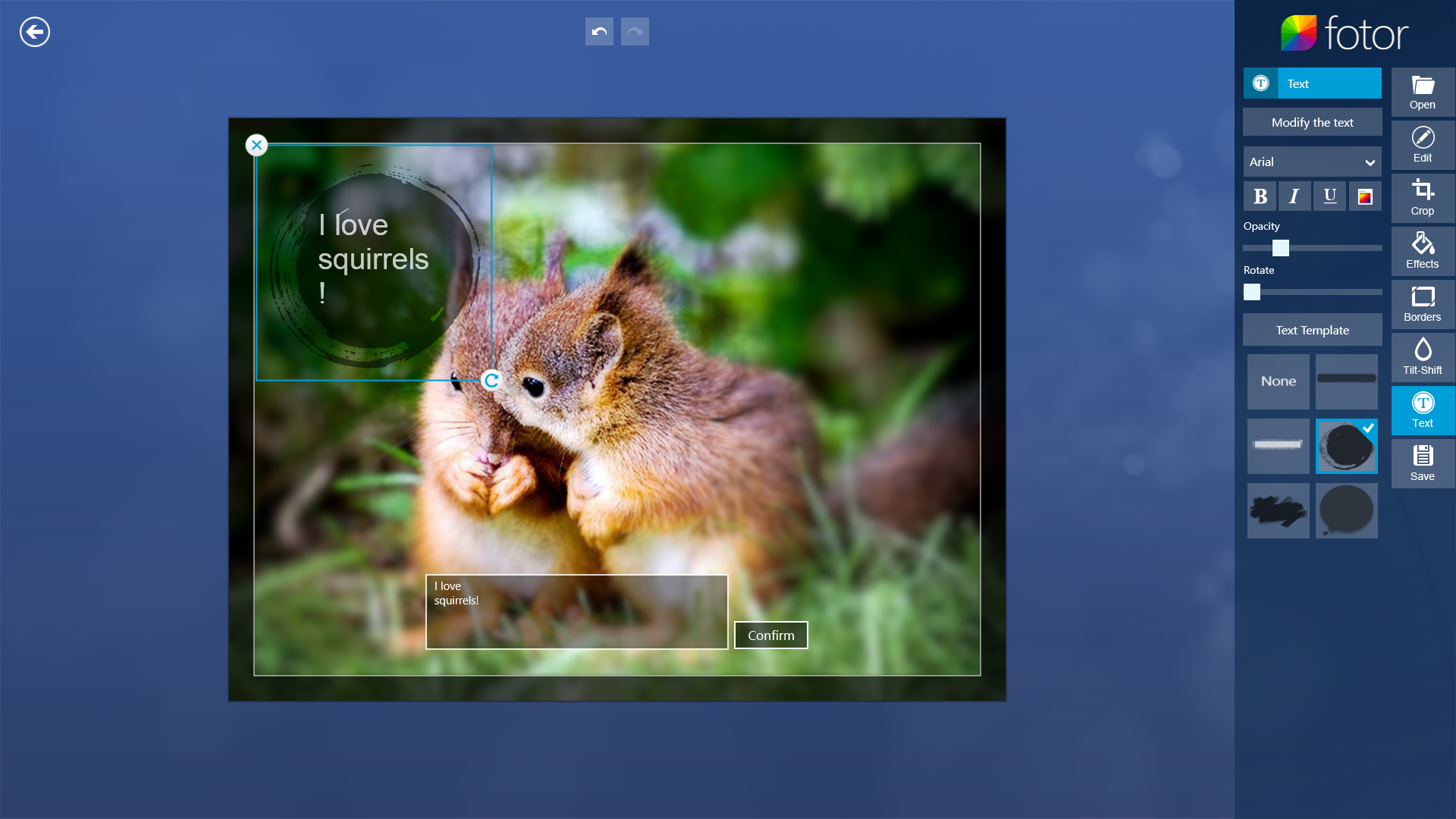
Fotor makes it easy to add text overlays to images, but you can control the font size independently.

When you launch Fotor, it lets you open an existing photo to edit, or start working on a collage. It also comes with six sample photos arranged in an attractive grid, to get you started. The simplest way to get a feel for what Fotor is like is to click a sample photo. Do that, and you'll find yourself in the editing interface.

In editing mode, the image dominates most of the screen, and an editing toolbar lines the right side of the screen—opposite where you'd normally expect it, but in keeping with the Modern interface convention. The toolbar is subdivided into eight sections, six of which contain editing tools: Basic editing (color corrections), cropping, effects, borders, focus effects, and text tools. The other two sections let you open new files for editing, and save your work.
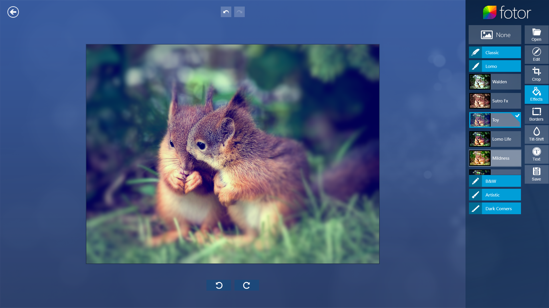
Fotor offers numerous effects, including crowd-pleasing Lomo looks

The color correction interface uses sliders, with live image updates: Just move the slider and see the change instantly. Cropping is similarly intuitive, with 11 preset aspect ratios, and a free-crop mode (to set your own aspect ratio). Just drag a frame across the image to set out your crop area, and click Confirm when you're happy with the composition.
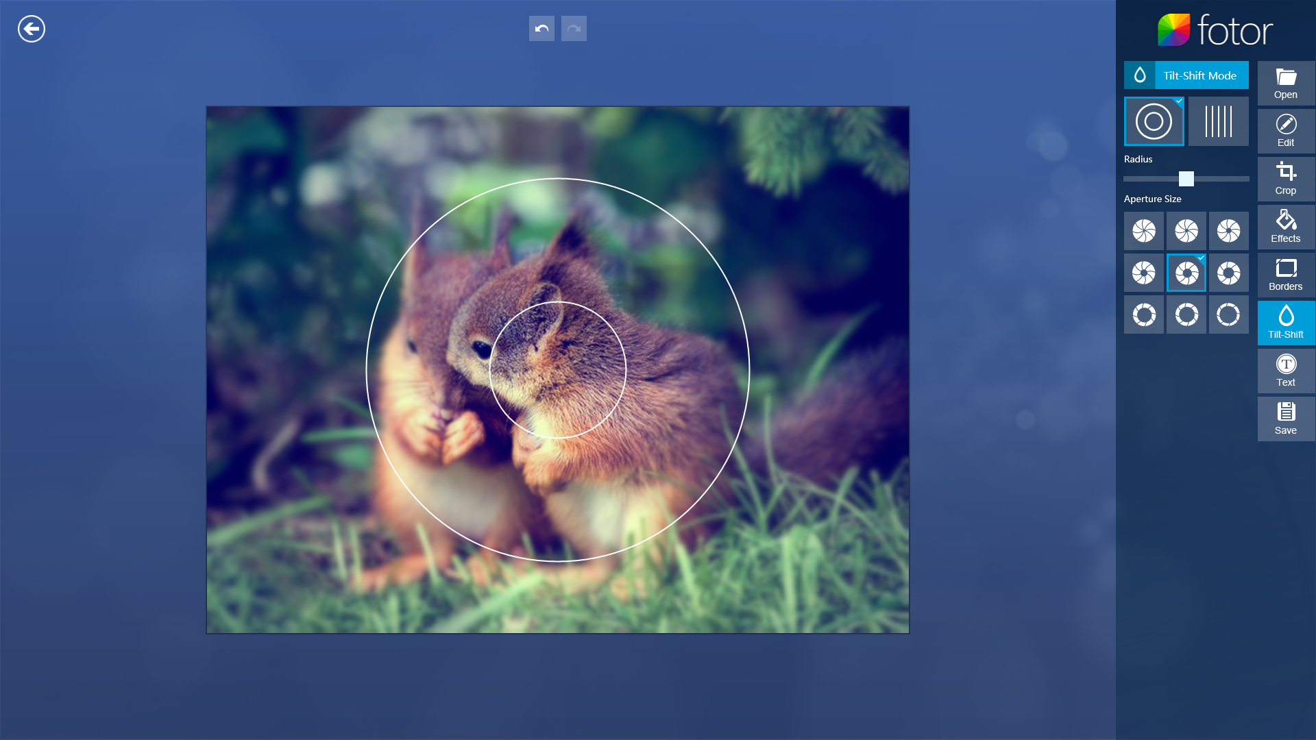
Fotor's selective focus tool is the most nuanced one in the app, allowing for fine adjustments.

Image effects are divided into five categories, ranging from Classic to "Dark Corners" (i.e., vignette effects). While each category contains many different effects, individual effects cannot be adjusted in any way. Many of the image modifications are heavy-handed, and Fotor offers no way to tone down the amount of influence a given effect has. Also, you can't layer effects one on top of the other. You need to pick one effect for your image and stick with it. The Borders category is similar: There's a rich selection of borders, but you can't tweak anything, like the size of the margin or the color of a given border.
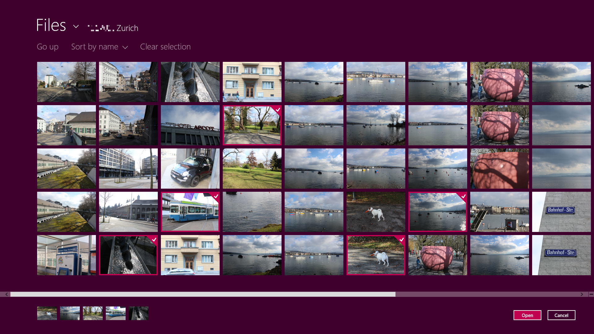
Fotor's collage mode makes it easy to pick a number of images for your collage.

One category that does offer fine-grained adjustments is the Tilt-Shift Mode, whereby you can apply selective focus effects to your image. Tilt-shift (a "miniature look") isn't the only option: You can also apply a center focus effect, where the subject appears sharp and surrounding detail is blurred out. Both center focus and tilt-shift effects offer many adjustments: You can change the tilt shift's angle, and change either mode's blur radius and virtual aperture size. Of all the tools Fotor offers, selective focus is the most nuanced.

Finally, you can also overlay your image with some text. The text tool offers a limited number of fonts (you can't pick from any font installed on your computer), and lets you pick one of several overlay templates, such as speech or thought bubbles. There is no way to control the font size independently of the template: You can only resize the text along with the speech bubble it's in.
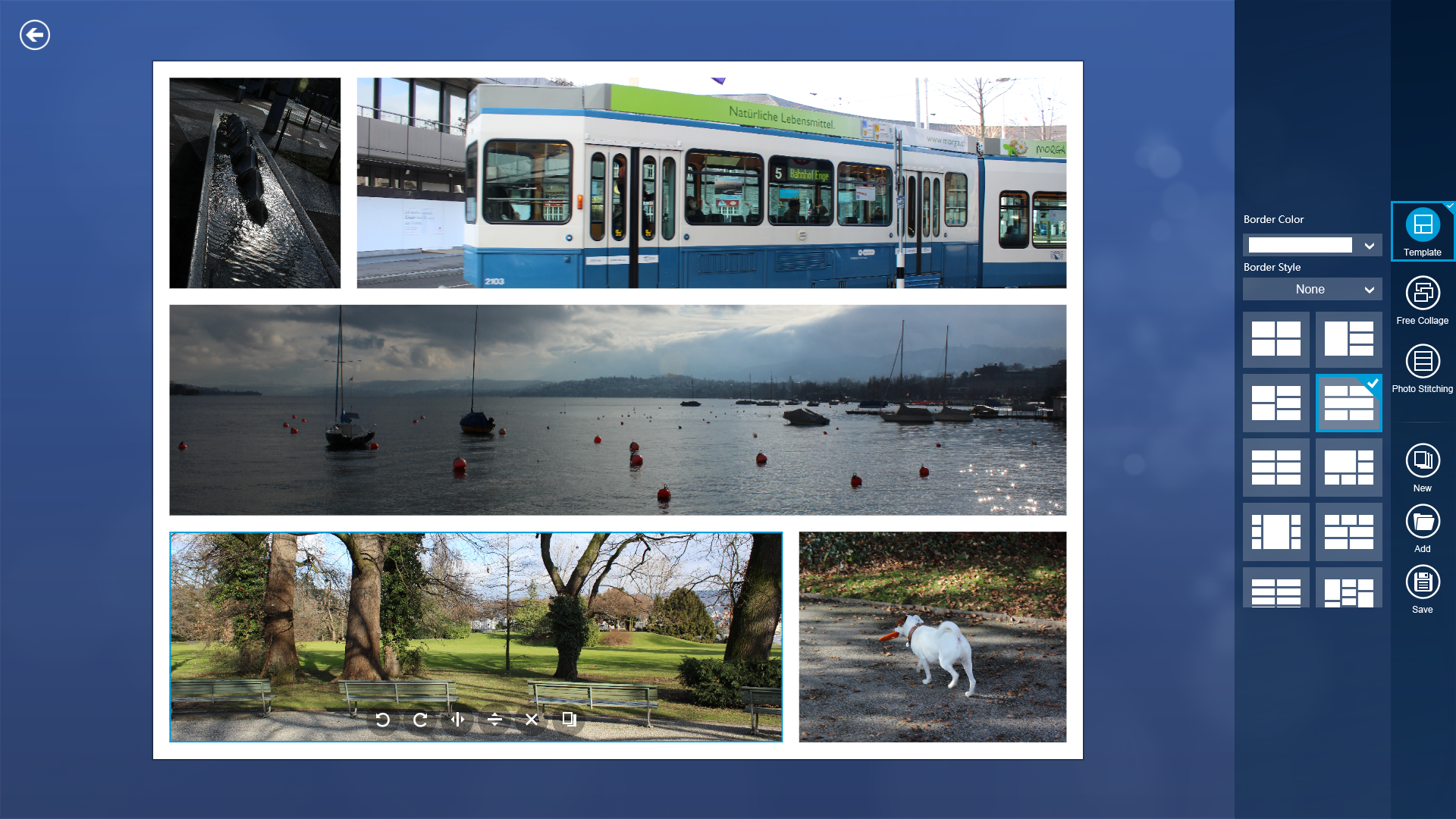
In collage mode, it's easy to move images around, resize the different parts of the collage, or pick one several premade layouts.

All in all, Fotor does what it does quite well. It excels in being quick, and quick to master. Few features are cryptic, and none appear to rely on hidden toolbars you need to slide into view. If you want to edit images in the Modern user interface, Fotor is a great option.

Note: The Download button takes you to the Windows Store, where you can download the software to your system.


View the original article here

Wednesday, May 8, 2013

Review: SmartDeblur restores blurred images, indulges CSI fantasies

AppId is over the quota

Cellphone cameras make amateur photographers out of all of us. We can relate to making blurred photos, which we normally then delete and forget about. But sometimes those blurry photos contain important information that we must retrieve. In these instances, it might be worth firing up the free SmartDeblur to see if it can work its magic on the picture.

When you open up the app, load the blurred image, and then use the sliders along the top to adjust the picture. Changes are applied almost instantly.

SmartDeblur is a small portable app available for Windows, Mac and Linux. It enables you to work your magic on photos by tweaking a couple of sliders back and forth which changes the colors and contrasts to make the picture slightly clearer.  In the end, it won't produce a perfect high-definition picture worthy of your photo album, but if you're looking to make some information a lot clearer, then this app can probably make some headway.

I'm not going to go into the technical hows and whats of the app, as frankly it's confusing (how many people can claim to know about the "Wiener, Tikhonov, and Total Variation deconvolution methods"?). The developer has written a few tutorials on his website for anyone interested in reading up on the technical side of the app.

The great thing about this app is that if you don't understand the technical side of things, or you don't want to know, you're still covered. The intuitive user interface makes using SmartDeblur absurdly easy. Simply download the portable app, unzip everything into a new folder (making sure you preserve the folder structure), and start up the app.  You are provided with an example image if you want to practice before trying the app on your own pictures.

When you have the picture loaded, simply move the two center sliders, "Radius" and "Smooth," from left to right. Almost immediately, you will see the image start to alter, based on the sliders' positions.  Eventually, you will get the best new version of your photo that you are likely to get, and you can then save the new image to your hard drive.

With a bit of tweaking, the image should become clearer. It will still be blurred, but may now be clear enough to see the information contained in the image.

As I said, it won't make it totally clear, but it may be just clear enough to read that car license plate so you can arrest the bad guys, just like in CSI Miami.  And since it's portable, you can keep it on your USB stick or in your Dropbox folder, to be used on whatever computer you happen to be working on.

All you need now is David Caruso's sunglasses.

Note: The Download button on the Product Information page takes you to the vendor's site, where you can download the latest version of the software.

Mark O'Neill

Expatriate Scotsman now living in Wurzburg, Germany, freelance writer, frustrated future bestselling author, obsessed bibliophile. Other interests include trying to understand The Architect in the Matrix movies, decrypting codes and ciphers, and trying to persuade my landlord and my wife to let me have a Highland Cow for a pet.
More by Mark O'Neill


View the original article here

Friday, April 12, 2013

Review: Automatically resize images on the fly with Robosizer

AppId is over the quota

If you are in the habit of sending images by email, you will know what an absolute pain in the neck it is to go through the tedious process of resizing them to send. It takes up precious timethat  could be better spent using, looking at cute cat pictures on Reddit. You know, more important stuff.

Robosizer is a free software app that sits in your Windows tray, and detects when you are sending an image via one of its supported email programs. When it does it will automatically resize the image for you (leaving the original image intact), according to the pre-set sizes that you specified in the settings beforehand. Robosizer really is a “set-and-forget-it” type of program. Pretty soon, you’ll forget that it is even there (if you switch the notification balloons off).

When Robosizer detects that an image is being sent, it will resize it to the specifications you set, and you will receive a notification bubble telling you it is being done


Installation is a breeze, with no devious toolbars or other nasty software trying to sneak in. When the installation has been completed, however, you will be invited to enter a serial code. It looks as if Robosizer used to be a paid app, but it’s now free. So look in your installation folder, and you will see a text file with a free activation code. Just enter that and you’ll be good to go. The developer has assured me that this minor nuisance will be removed soon.

When you start it up, you will see a little robot face sitting in your Windows tray. Right-click that and choose the settings. It’s here that you need to set up your “profiles” – in other words, the settings for each program. A wide range are covered, (including Firefox, Gmail and Skype) so you are sure to find a few things there that you already use. At the time of writing, Internet Explorer 10 on Windows 8 is not supported, but the developer is working on fixing that.

Robosizer works with a wide range of popular services such as Gmail, Facebook, Chrome, Firefox, Opera, Outlook and many others..


To set up your profile, drop the menu down and choose one. If your program is not there (and Robosizer supports it), click “new”, type the name of the program, and a new profile will be set up for you. You will then see boxes for the “max image width” and “max image height”. You can enter either one or both, in pixels. You can also specify whether or not the height or width should be “enforced”. By that, it means that when resizing, do you want it to specifically focus on the width, the height, or neither? Then specify which file types will be resized (there’s a startling lack of support for GIF images). Rinse and repeat for other profiles. When they have all been completed, click “close” for Robosizer to go back to snoozing in the Windows tray, waiting for an image.

When it spots an image being attached to an email, Robosizer will spring into action, resizing the image and inserting it into your email message. You will get a notification balloon telling you it’s currently going on  and your original image stays in its original location with its size untouched. The resized version sits in Robosizer’s cache folder (the location of which you will find in the “program settings” tab of the Robosizer app). Bear in mind though that these resized images are deleted when you “exit the program or restart the computer”. So if you want to keep copies, do it right away.

I test a lot of stuff out for PC World and I mostly delete it all afterwards when the review is done. But Robosizer is staying put on my computer as it is extremely useful. No longer will I gnash my teeth in frustration when I realize that the enormous David Hasselhoff picture I want to send to someone is needs to be resized. Robosizer, my new friend, will take care of that for me. Thanks Robosizer. You’re my pal. But you won’t be my  BFF until you get along with GIF images.

Note: The Download button on the Product Information page takes you to the vendor's site, where you can download the latest version of the software.

Mark O'Neill

Expatriate Scotsman now living in Wurzburg, Germany, freelance writer, frustrated future bestselling author, obsessed bibliophile. Other interests include trying to understand The Architect in the Matrix movies, decrypting codes and ciphers, and trying to persuade my landlord and my wife to let me have a Highland Cow for a pet.
More by Mark O'Neill


View the original article here

Thursday, December 27, 2012

Working with images is easier in the new Word

Error in deserializing body of reply message for operation 'Translate'. The maximum string content length quota (8192) has been exceeded while reading XML data. This quota may be increased by changing the MaxStringContentLength property on the XmlDictionaryReaderQuotas object used when creating the XML reader. Line 1, position 8904.
Error in deserializing body of reply message for operation 'Translate'. The maximum string content length quota (8192) has been exceeded while reading XML data. This quota may be increased by changing the MaxStringContentLength property on the XmlDictionaryReaderQuotas object used when creating the XML reader. Line 1, position 8952.

This week's post comes from Theresa Estrada, the Word team program manager working on improvements to images.

How many times have you tried to move an image or a chart in Word and gotten frustrated when it unexpectedly landed somewhere other than where it was dropped?  Working with images is one of the top pain points that we hear about from customers, so in the new Word, we’ve simplified the experience with 3 great new features:

The Layout Options button gives you quick access to change how your image interacts with the rest of your document.Live layout lets you see your document’s new layout in real time as you reposition, resize or rotate images

Alignment guides help you visually align your images with important areas of the document

Our first step in simplifying the way you work with images was to add the Layout Options button.  This button appears at the upper right of any image, video, shape, chart, SmartArt or textbox that you select and gives you quick access to the text wrapping options. 

In prior versions of Word, images were inserted as “In line with text” by default.  Inline images are treated exactly like a character of text, which means their position is constrained to the lines of text on the page.  Great for predictability, but not so great if you want to place the image in a more interesting place on the page, like the top right corner, or if you want the image to look integrated with the text in the document.

For many versions of Word, we’ve offered the ability to wrap text around images in a variety of ways.  In the new Word, we’ve made it even easier to find those options and quickly switch between them.  Simply click the Layout Options button and choose one of the six choices in the call-out under “With text wrapping”

We’ve even made it simple to set your default wrapping style.  Just right click on one of the styles in the Layout Options call-out and click Set as default.  Next time you insert a picture, chart or SmartArt, it will use your default wrapping style.

Once you switch to one of the “With text wrapping” styles, you’ll notice two things:

An anchor icon shows up in the documentThe options at the bottom of the Layout Options call-out are available

Images that have one of the text wrapping styles applied are referred to as “floating”.  Other than the obvious visual distinction between inline and floating images, they are also treated differently under the covers.  As I mentioned above, inline images are just like oversized characters.  Floating images, however, are attached to the text by a hidden character that we refer to as the anchor.  In past versions of Word, you could go into Word’s Advanced Options dialog box and turn on the display of the anchor character.  To make this a little more obvious, we’ve turned it on by default in the new Word. 

Knowing where the anchor is on the page can help put you in control of how your image behaves as you edit the document. The most important rule to remember about anchors is that an image and its anchor always have to be on the same page.  This explains why sometimes, when you add or remove text in a document, an image will suddenly jump to a different page.  What has happened is the text containing the anchor was moved to a different page and took the image along for the ride.

The floating text wrapping styles control the way that an image interacts with the text in your document – whether text can flow around all sides, only on the top and bottom of a figure, or if the image is above or below the text.  But there’s another piece to the puzzle of controlling image behavior: what happens to the image when text is added or removed from the document?  Sometimes, you want the picture to remain relative to the text – in other words, move up and down on the page along with the text where it is anchored.  In this case, you’ll want to choose the Move with Text option in the call-out.  Other times, you might want the image to be relative to the page – in other words, always stay in a certain spot on the page it's anchored to, like the in the top right corner or in the center of the margins.  In these cases, you’ll want to choose the Fix Position on Page option.

Regardless of which option you pick, just remember that the text the image is anchored to always has to be on the same page as the image.  So if you move the text containing the anchor to a different page, the image is going to move as well.

Without a doubt, my favorite feature in the new Word is Live Layout.  In the past, when you moved a floating image in a Word document you would see a semi-transparent “ghost” of the image moving around on top of the text:

When you dropped the ghost, the rest of the document content would update – which sometimes lead to unexpected results and meant it could take a couple of tries to position the image just right. 

With the new Word, when you move a floating image, you’ll see the layout of the document changing in real time so you can position your image with confidence on the first try.  Live Layout also works for resize and rotation of both inline and floating images, as well as for resizing table rows and columns.  Give it a try and tell us what you think!

Using Live Layout, floating images can be placed nearly anywhere on a page, but there are a handful of places where you’re more likely to want to place them: aligned to interesting areas like the margins or edge of the page, centered on the page or aligned with a paragraph of text.  You can use Live Layout to help accomplish this, but we’ve also added some handy alignment guides to help make sure you hit exactly the spot you’re aiming for. 

As you move your image around the page and reach one of the alignment locations, you’ll see the green alignment guide lines appear.  Here, you can see that the image is aligned to the top of the first paragraph and the left margin.

 If you are ever wondering if an image is actually aligned to something, just click on a hold for a second: any guides that it is aligned with will appear.

I hope you’ll spend some time trying out our improvements in the Office Customer Preview and tell us what you think. If you’re interested in learning more about inline and floating images, take a few more minutes to read these posts:

Understanding images: The basics
Understanding images: Wrapping styles
Understanding images: Staying in position


The figures feature crew is excited to share all the improvements to working with images with you!


View the original article here

Friday, October 12, 2012

Make your images look their best

Today's post comes from Alyshia Olsen, to improve the program manager responsible for our photo-editing tools in the new Publisher.

People use Publisher to a lot of different types of publications - newsletters, photo albums, and brochures for example. These publications look with rich images better. In the new publisher we have with you easily publications create professional effects with a few simple clicks.  Our new graphic features can be used to optimize images, the over or underexposed or one to emphasize certain part of an image.

You can change your image brightness and contrast as well as the colors of the image from a set of default styles.  Go after you insert an image to see previews how your image with the preset effects will look for formatting graphic Tools tab on the Ribbon. As you hover over the options under corrections and Recolora live preview appears in the publication.

Recolor the first conform, we added the ability to photos based on a desired color palette (for example they make black and white, or sepia or toned to a certain color to the rest of your publication are the same.)

The Gallery Recolor is on the picture tools tab with all the tools, you need to fit your publication photos:

Here are the results of the few recoloring effects. Black and white and sepia are shown below, but you can choose any color from the color picker:

The next conform, which we added to the possibility of photos too dark, washed out to correct or need just a little bit a different effect really shine. The corrections Gallery is on the picture tools with a variety of brightness and contrast Presets tab to help you quickly correct your images or make more in the deep tools to fine-tune.

The results of some of our corrections effects are shown below. You can see that a washed out image is better looks with less brightness and more contrast, while a gloomy picture with more brightness and less contrast looks better. Try these effects to your pictures, look their best in the publication to get.

Adjust your images to help you, we moved to the command to cut to shape to a more accessible location: in the crop drop - down-list Format tab image tools .


Simply select a shape, and then drag the crop markers around the shape to your image in a circle, oval, cropping or other form in our gallery!

During the harvest:

After the harvest:

In the new Publisher, we can, from any image beautiful full-page image backgrounds create added. Fill all image adjustments that you want, such as recoloring or add transparency, and with the right mouse button image and choose apply to background. This command is found on the tab page design image calculations. You can then fill the background, or tile - the image in the background.

You can mix and match all these image adjustments and cropping, to customize the look of your publication. The page in the picture below has a color, and changing brightness and contrast, and was applied to the background of a page:

This new image adjustment options offer you more choice than ever before, allowing you to get the right look for your publications. All these changes were you from the image adjustments feature crew brought. We hope that you try some of these built-in options in the next publication!


View the original article here

Monday, June 11, 2012

Crop to irregular images

This is the sixteenth in a series of quick video tips for executives, with PowerPoint of guest blogger Bruce Gabrielle, author of PowerPoint to speak.

[Note: in his last video of the series Bruce Gabrielle showed you make as a picture within a picture stand out.] [Here is the next step.]

Such as cutting you the background of photos, an irregular shape like a coffee cup, stop sign, or even a person left? Here is a Möglichkeit--use the drawing tools in PowerPoint.


View the original article here

Tuesday, April 24, 2012

Tuesday, July 5, 2011

How to load dynamic images in a PDF file using Reader/Acrobat 8+

How to load dynamic images in a PDF file using Reader/Acrobat 8+ « David McMahon function clearSearch() {document.search_form.s.value = "";} adobe.com      David McMahon / How to load dynamic images in a PDF file using Reader/Acrobat 8+by dmcmahondynamic (1)href (1)images (1)  

View the original article here

Tuesday, June 28, 2011

Understanding images: part 3 - implementation

Why jump figures (images) sometimes to another page in your Word document?  This is one of the great secrets of Word and today, I will show the answer.

On the reason of this question go, it is important to understand the concept of anchoring. Covered in a previous post I, the difference between floating and inline figure. Each floating number in a Word document is actually attached to the page. This point of the attachment is referred to as the "anchor" and is indicated by a small anchor icon. To see this, you must enable the display of the icon by clicking on the file tab, and then click Options. In the display section, select the check box next to the object anchor.  Now, if you select a floating figure, you see the anchor icon on the page displayed.

Page with text, floating figure, and arrow pointing to anchor

There are two important rules about the relationship between numbers and anchor:

Rule # 1: the anchor and the figure must be always on the same page.
Rule # 2: the anchor and the figure must be in the same place on the page.

By default, the anchor is placed at the beginning of next paragraph about the upper-left corner of the figure. If you moved also move the figure on the side of the anchor, using the same logic, to place the anchor. Word does this, because a figure close to certain text place usually means that there is a relationship between the two parts of the contents.  It is also possible, select the anchor, and drag it to a new location on the page. For example, in the following document paragraph describes the data in the chart, however, the diagram looks better when I place it at the bottom of the page.

 Page of text with chart at the bottom and anchor at top

The anchor is considered, so that if you select the text where the figure is anchored, the figure is also selected, you see the relationship, to help characters. When you move or delete you the text in which the figure is anchored, the figure is also moved or deleted be.  When adding text about the anchor position of the anchor are moves also, below on the page along with the rest of the text.  When the anchor on the next page is moved the corresponding figure also jumps to the next page (see rule # 1 above). This can be especially confusing when the number of the anchor.

In many cases want you owed your text and figure, also if the jumping to another page. In other cases, can you force a figure to remain in a position, regardless of what happens to the text surrounding it. An easy way, so that it jumps the figure is following: less likely

Choose the figure so that the anchor icon is visible.Click on the anchor, and prefer you text on the first line of the text on the Seite.Wenn the first line on the add page, you need to position the anchor at the top of the page.

There are many other aspects of the anchor, the you very precise control over your character behavior. Stay tuned and I'm going to delve into a few of those in a future post. Read the first two posts in this series here and here.

--Theresa Estrada is in the word team spends most her days (and some nights) studying how users with numbers in their document work program manager.


View the original article here

Monday, June 27, 2011

Understanding images: part 4 - stay in position

Sometimes, especially when you try to create a 1-page flyer, you want to position a figure at a particular location on the page and make sure that it stays put.  One possibility is the position in the menu on the Ribbon format use to align your figure with one of the nine common positions on the page:

Position menu

To position select one of the options in the section with text wrapping to your figure will do three things:

Go you your character from inline to floatingApply square text wrappingPosition the picture relative to the edge of the document

The third item in the list is the key (and what does this menu different menu wrap text ).  To understand what it means, we go back to my previous post when I said that the relationship between a character and its anchor.

In this post, I mentioned that the picture will move if the text, the, which it is attached, moved.   This is because, by default a character relative to the text is positioned where it is anchored.  In most cases because it tends to a relationship between the text and the illustration, this is exactly what to do.

We see an example of us.  The following document I added a picture to go along with the family magazine I write.  The image is related to paragraph, where you can see the anchor icon:

Document with text and picture of a child on the beach from Office.com

When I later add a different paragraph (the blue text), which pushes the text and the anchor to the next page, the image on the next page moves.  Once said there, the same position relative to the location of the anchor - in this case over an inch after down from the top of the paragraph:

Two page document with figure moved to page 2, picture of child on the beach from Office.com

If a character is position relative to the edges, what happens if you use the location menu, are not on the page move as the anchor moves.  But when the anchor to the next page pushed the figure still jumps to the next page (see rule # 1 in the last post).  In this case, the figure in the same relative position on the next page remains.


Again the example when the image originally relative to the edge on the first page, positions were above, when I insert the blue text and press the figure in a two page-the result would look like this:

Two page document with picture moved to bottom of page two; picture of child on the beach from Office.com

Note that the image keeps its relative position on the page in the lower right corner, if it is moved to the next page.


If you see exactly how your figure is positioned and whether it moves with the text laid down or will remain in a fixed position on the page, you can look at the Advanced Layout dialog box.  Select more layout optionsmenu at the bottom of the position .  On the tab position in the dialog, you see several options to align an image vertically and horizontally.  At the bottom of the dialog box is called an option to move with text.  Try selecting and clearing, the option and see how the settings above to change this behavior to enable.

--Theresa Estrada is a program manager on the word team, which most of their days (and some nights) study, spends as user numbers to work in their documents.


View the original article here

Images pop with simple photo editing in Office 2010

This is the first anniversary of the release of Office 2010 with tips and tricks for the most of your Office to the post # 9 in the ten days celebrating series for Office.

The cliche "a picture worth 1,000 words 's" reserves the right, as a large image gets to the point in such a way that can replicate any amount of text. With Office 2010, you can to your advantage: you have no more back and forth to jump between your document and your image editing, since so many tools are directly integrated in. Office will help you to turn slightly good pictures into great pictures, and good documents and presentations in one in the amount of memory.

There are many things you can use images in Office 2010: they correct color, artistic effects like pencil sketch apply, borders set up, rotate shadow, etc.,. But I have a thing for photos, personally, that are mostly black and white, but have some hint of color. It is my favorite trick to show the new photo editing tools. Follow up with me and also this tip you can beautify your Word documents and PowerPoint slides.

I started with the photo below, and you need two copies of the same image to this effect:

Basic image before alteration

When you insert your picture, opens Image tools on the Ribbon. Select the command text wrap Image toolsand click on the text on the option. Then you can simply copy and paste the image, fall to a second picture of the first.

Then I choose one on the back and use the photo format it black and white.

Color image superimposed on black and white image

In Tools/image format, select the color control and for the black and white example in the section of color saturation .

Use you then remove background tool on the front, color the image to pop out the part that you want to really show:

Color part that you want to pop

Select from the Image tools again remove background and draw that only the part that you want to keep. Then the adding and removing of marking tools on the Ribbon use to pull you through the areas where the remove background tool incorrectly is rates.

Slide the upper picture things finally back on the floor, on line:

2 images superimposed again

And voila! There, you have a composite image effect, can contact you only with very expensive tools and much free time on your hands.

This is of course only a fraction of the amazing things you can do with the integrated image editing tools in Word, Publisher and PowerPoint 2010. plus you can even trim, recolor and format videos in PowerPoint 2010. finding many more tips and tricks for working with pictures on the Word blog and the PowerPoint Blog. Check out this post which also background remove for ever the image exactly right.

Thanks to Office 2010 and congrats to the one-year anniversary.

--Chris Bryant


View the original article here

Sunday, May 29, 2011

Find out images: part 1

Theresa Estrada, program manager in the word team, writes today about the basics of working with graphic objects-forms, text boxes, pictures, and more. This is the first in a series of posts about graphics objects.

Numbers, also known as widgets, a ton of pizazz to a document can add, but it not always behavior the way as you would expect maybe that can be incredibly frustrating. With a little behind the scenes information can you your numbers in their place.

What I mean when I say "Figure"? A character is any type of graphic object, you can insert in a document, with the exception of tables. These include shapes, text boxes, images, clip art, charts, SmartArt and WordArt.

With regard to the numbers in your document behavior are there two basic types:

A figure behavior, you can use the menu wrap text the section order on the format tab that displays when you select the figure:

Wrap text menu on Format tab

Numbers, the the square, tight, through, up and down, behind textor before text use wrapping style are all as floating. As know which option you use?

The default behavior for images, clip art, charts and SmartArt is in line with text or inline. If a figure is inline, it is treated just like any other character in the document. For example, if you insert a picture as the dog pretty down, has it actually are in a row. The line height increases to take the picture, and the image moves with the text surrounding it. The figure is not formatting it is applied to the paragraph in that respect as such as alignment of the paragraph in the middle of the page.

Puppy with rubber duck by Fotolia at Office.com/images

Inline behavior familiar figures and is predictable, but the downside is that they are bound to the lines of text. This means that you can this position without resorting to fancy layout tricks in many places on the page. These figures look not usually associated with the document, integrated, because wraps the text around them not. Finally, there is no way to force an inline figure in a particular place to stay.

Enter the floating figure, which is the default behavior for shapes and text boxes. The big difference between inline figures and floating numbers is that floating numbers on a separate level drawing will be inserted. Nothing in the drawing layer "floats" regardless of text, which means, that you can position a floating figure almost everywhere. These figures can text wrapping around them or be positioned before or behind text. Text wrapping can integrate a figure with the rest of your content as you can see from the dog picture in this example:

Photo inserted in text as floating figure; Puppy with rubber duck by Fotolia at Office.com/images 

Floating numbers are incredibly flexible in how they can be positioned, and they solve most problems associated with line numbers. However, sometimes, this flexibility can lead to surprising results.

I will be the next couple of blog posts demystifying the options for the floating figures, including spend:

How to flow around your numbers in various way text. Why your numbers sometimes jump to new locations (and how to avoid!). Fast ways to get numbers with each other (and stay) align.

--Theresa Estrada is in the word team spends most her days (and some nights) studying how users with numbers in their document work program manager.


View the original article here